
I plotted a Chloropeth Map of Police killings in Usa in year 2015 Police killings have become rampant, I used statistics data collected from official sites, it is already in csv format.Using a ShapeFile downloaded from Census.gov.. I have plotted a Choloropeth map for Police killing rates as per State using Basemap Library.
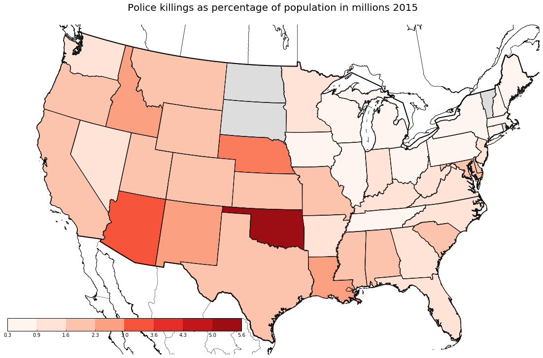
The highest killing rate, viz calculated per population in millions in each state, is the highest for Okalahoma followed by Arizona and Nebraska. I plotted this map from a ShapeFile before, I worked with datameet. At datameet we created a workable map of Maharastra’s village boundaries. There was a stark difference in the shapefiles available for the US districts versus their Indian Counterparts. The ShapeFiles available from every census differ vastly, the data is unclean. We plotted the map in QGIS, I worked on data analysis in R to merge and clean the files.
I also performed some analysis with ethinicty related variable, to check for correlation, to check the answer click “Read More”