
Data was compiled from various resources such as here and here. There are several related datasets on the same website that cover demographic information and test scores. Here are the names of all I will be using, you can search using following names:
- SAT scores by school
- School attendance
- Class size
- AP test results
- Demographics
- School survey
I combined relevant data into one DataFrame and then found that SAT Scores are Higher where english learners are lower in percentage.
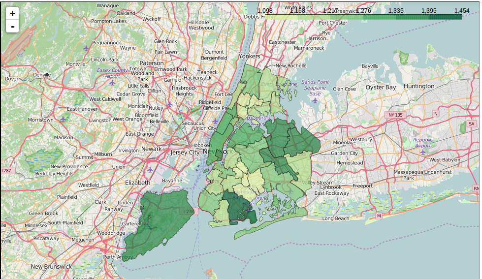
The above map is of SAT Scores as per district.
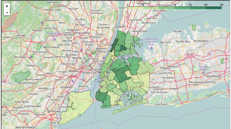
The above map is of english learners percentage as per district. Clearly they are complements of each other, Staten Island has higher SAT scores and low English learners percentage.
Heatmaps are good for mapping out gradients,Folium library gives us this, but we’ll want something with more structure to plot out differences in SAT score across the city. School districts are a good way to visualize this information, as each district has its own administration. New York City has several dozen school districts, and each district is a small geographic area. We’ll now we able to plot the average SAT score in each school district. In order to do this, we’ll read in data in GeoJSON format to get the shapes of each district, then match each district shape with the SAT score using the school_dist column, then finally create the plot. To read more click the link. Read more..